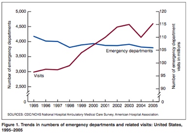
hmmm. seems to me in a market economy that demand and supply are inversely related for only a short time until the genius of the markets corrects the problem. something is weird about this graph but, wow, i can’t place it. must think more. hmmm.
What is the drop in 2004 attributed to?
There has generally been an “endorsement” of going to EDs by many practices by sending patients to EDs. Most times offices do not want to bother with impromptu patients — you do not significantly increase your net income, they only add to the workload of the day, and many are people you can’t get to come in for routine visits, but when something comes up they want to be seen NOW.
A more accurate graph would be # of visits vs. # of beds…Pretty much every ED in town is increasing or planning to increase the number of beds.
Probably the most interesting thing on there was the # of younger patients (22-49) that were seen. Per capita, they are seen the most when, presumably, they’d have the fewest # of health problems.
911doc, the “genius of the market” can’t manifest itself in this situation because our masters in Washington have been meddling with the demand curve. Demand has spiked because the “genius of central government control” produced EMTALA, which decrees a “medical screening” for anyone crossing the threshold of the ER, regardless of ability to pay. The demand for free ER services is always going to exceed the supply of those services, because it costs actual money to supply them. I recommend “the genius of Economics 101.” It will help you understand these mysteries.